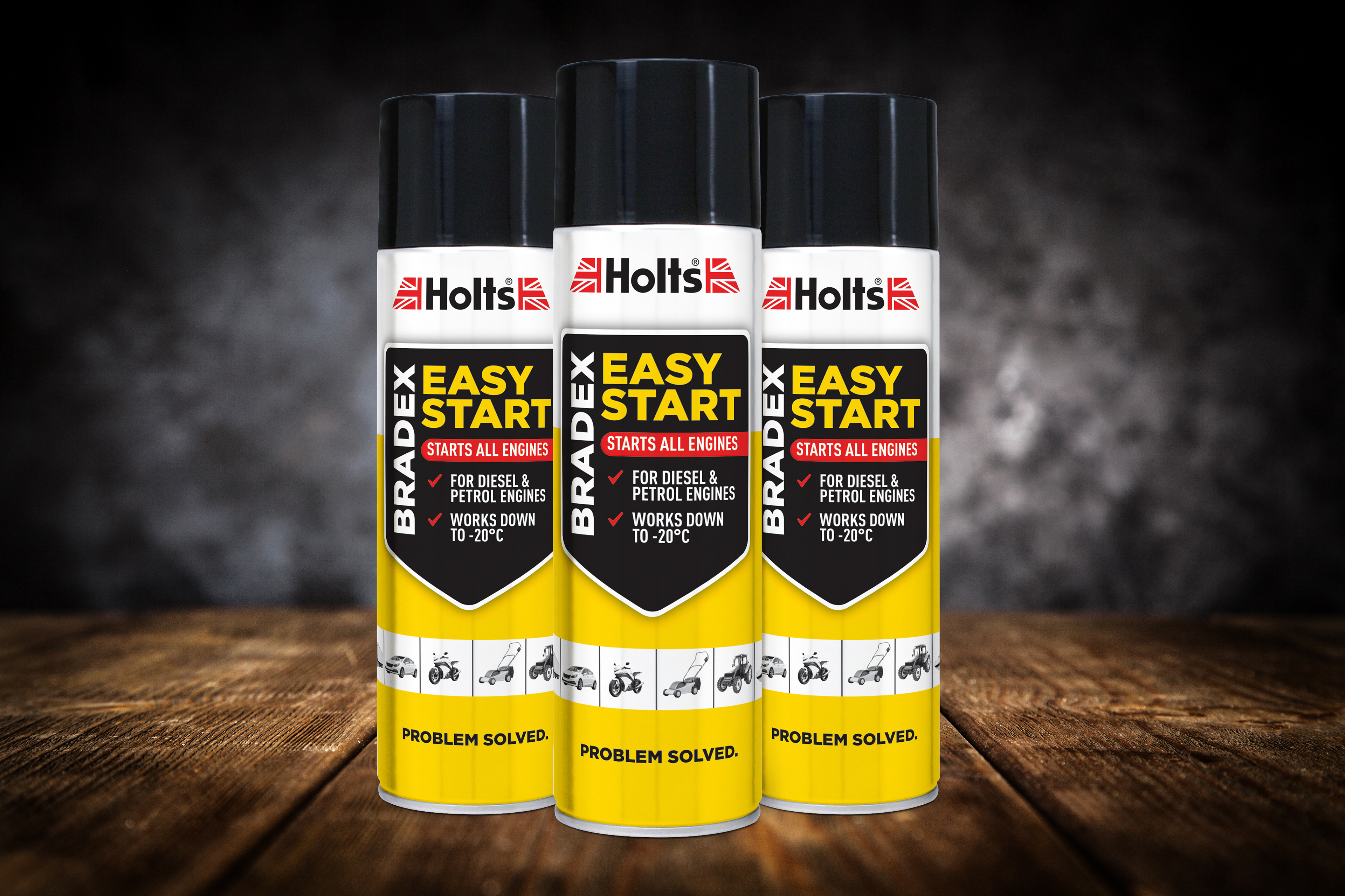
REDESIGNING OLD BRADEX EASY START DESIGN TO FALL IN LINE WITH THE OTHER PRODUCTS
Tasked with redesigning the Bradex packaging after thirty years. The old design was functional, but dated. The challenge was to create a new look to freshen up the design and bring it to life on the shelf, without alienating old customers.

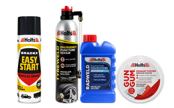
Old design next to our other new products
Original concepts were trying to keep the original shield design, but make the content of the front of the can make more sense to read down. I kept all the original colours, but thought more of a grey look would modernise the design. As a compromise, to keep it closer to the original design, we decided to keep the main colours on the tin yellow and white.
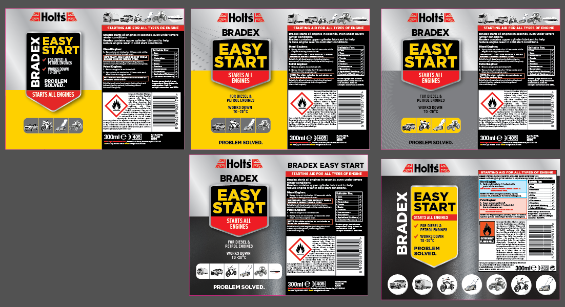
Original final concept, before the yellow and white were added back in
